Plan for tomorrow, today.
Harris Vision builds patient admission prediction dashboards that help NHS trusts spot pressure before it lands on the board. What if your team could see tomorrow’s demand at 6 a.m., not after the emergency department has already filled up?
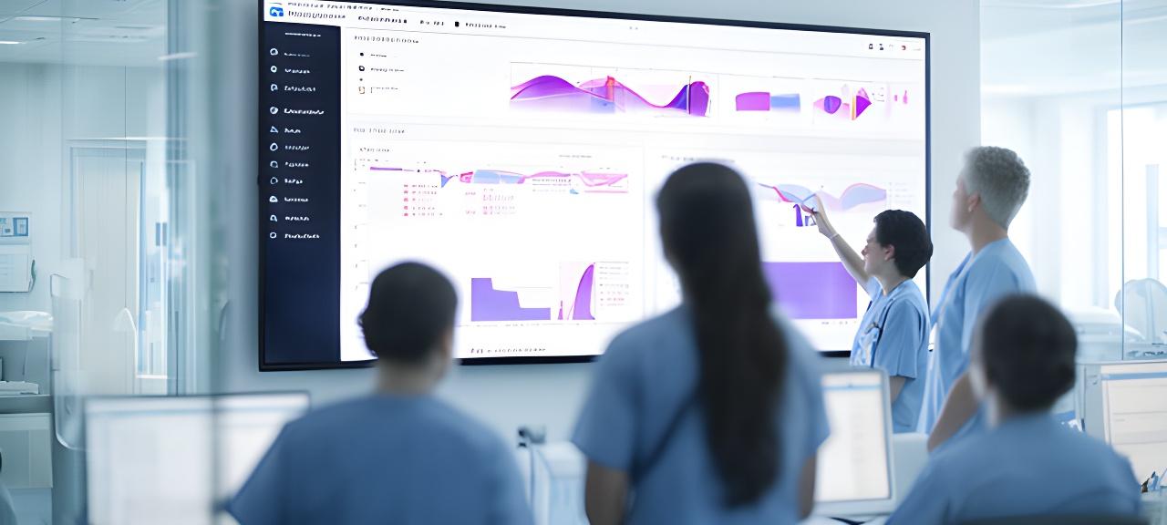
What if you could see tomorrow’s patient volume today?
Our dashboards combine historical admissions, GP referrals, 111 calls, weather patterns, and flu surveillance into one operational forecast. That means less guesswork, fewer bottlenecks, and fewer late-night firefights.
Built for pressure points
Need clearer bed management, earlier discharge planning, or better staffing calls? The dashboard surfaces the pressure before it becomes visible on the ward.
Updated every morning
Forecasts refresh by 6 a.m. so site managers start with a current view, not yesterday’s story. Clean. Fast. Actionable.
Made for governance
Compliance, auditability, and role-based access are baked in. Because a beautiful dashboard is only useful if people can trust it.
How we forecast patient flow
Why rely on one signal when the whole picture is available? We merge operational and public-health data, engineer useful features, train the model, then present the result in a dashboard teams can actually use.
Data ingestion
Admission records, GP referrals, NHS 111 calls, weather, flu surveillance, and seasonal patterns are pulled into one pipeline. That wider context matters, doesn't it?
Feature engineering
We translate raw signals into meaningful patterns, from weekday effects to weather-linked spikes.
Forecast delivery
Gradient-boosted trees produce the demand outlook, with confidence intervals shown alongside the forecast.
Accuracy snapshot
UK healthcare data
Designed around NHS datasets, local demand patterns, and operational realities.
Confidence intervals
Planned capacity is shown with a range, not a single guess.
Controlled access
Role-based views keep clinicians, managers, and executives focused.
A bento view of the pressure points
Two larger panels carry the story. Three supporting cards show the details. Why bury the essentials under noise?
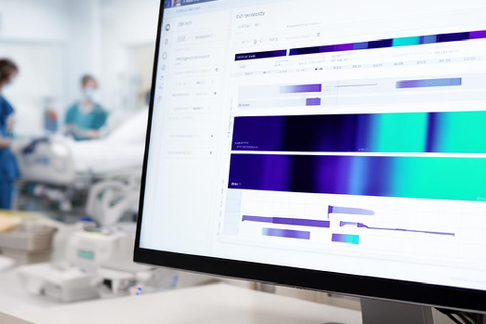
Bed occupancy tracker
See available beds, occupancy trends, and predicted strain across wards. The view is immediate, clean, and built for daily rounds.
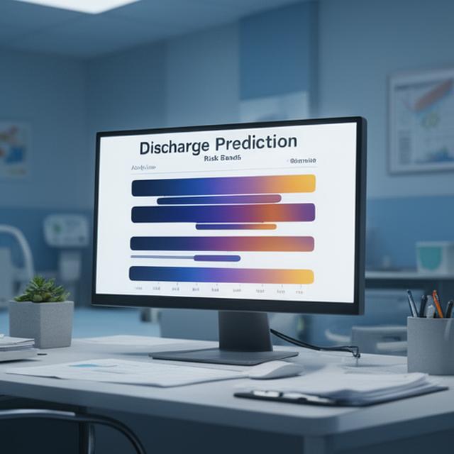
Discharge prediction
Spot which patients are likely to move sooner, so flow is easier to plan.
Theatre utilisation
Match theatre schedules to admissions pressure and release hidden capacity.
Staffing recommendations
Shift suggestions align with the forecast, not gut feel.
Role-based access
Clinicians, bed managers, and leaders each get the right level of detail.
Screenshot-led previews
Hover to reveal what the live dashboard feels like before deployment.
Test different scenarios
What happens if staffing changes, or elective activity shifts, or one more ward opens? The simulator makes the trade-offs visible before the day starts.
The sliders are simple on purpose. Can your team read the result at a glance?
Predicted wait time impact
Current state versus the recommended position
Reducing wait times when winter pressure hits
The trust was dealing with 12-hour A&E waits and frequent escalation calls. Could a single operational view calm that chaos? The answer was a forecast-led dashboard, built around a 7-day view and clear staffing recommendations.
The nicest part? Staff stopped chasing the day and started steering it.
Before and after

Before: queues building, decisions lagging.

After: demand visible, actions prioritised.
- Integrated with NHS data standards
- Forecasts delivered by 6 a.m.
- Designed for real operational conversations
One clear testimonial, no fluff
East Midlands NHS Trust
“Knowing our predicted admissions by 6 a.m. has transformed how we start the day. We’re no longer reacting, we’re planning.”
Dr Adis Imoru, Medical Director
Arrange an NHS-focused demo
Tell us your trust name, your role, and the operational headache you want to solve. We’ll prepare a tailored example before the call, so the conversation stays practical.
Talk to an analytics specialist
Want the fastest route to a working dashboard? Start here.
- +44 7777 872761
- [email protected]
- Islip Street, London, NW5 2DL, United Kingdom
- Response within one working day
Questions NHS teams usually ask
Straight answers. No jargon. Because the fastest way to judge a dashboard is to ask the awkward questions first.